Yesterday Navigraph released their new charts product also including a new pricing scheme. This, of course, comes about a week I released a post on their product and their pricing. I will update those posts and take the opportunity to evaluate their new offering to see if it is worth the subscription extension that is coming up for my account.
Navigraph comes with both a desktop software (on Windows) to download and print the charts as well as a web-based “Charts Cloud”. Accounts are always valid for both, during pre-flight I tend to use the desktop software while enroute I occasionally have the cloud product open on a small laptop computer next to me. My biggest fear as they announced an upcoming evolution of their products was that they would discontinue the desktop product with tablets being omnipresent nowadays, fortunately that did not happen.
User Interface Changes
So, let us first discuss the new desktop software, “Navigraph Charts 5” (updated from version 4). As far as I can tell, other than the obvious replacement of the contained charts, only one minor UI element has been added. The charts are now color coded in the listings, making it possible to easily distinguish between “General”, “SID”, “STAR” and “Terminal” charts. This color coding reflects the color coding used on the charts themselves. My guess is, the original real life aviation product they are based on come in binders and this makes it easier to find the approriate pages. A nice little touch to have this in the application UI, it might make it easier to quickly find the charts for the larger airports.
In the cloud-based interface I also don’t find any other changes than the same addition of color coding to the chart listings. Especially there have not been any improvements to the enroute chart integration, meaning that the user experience still lags behind the free SkyVector website, as I noted in my previous blog post on chart products.
The New Charts
Not much to report on the UI site, so let us continue on to the really interesting part, the new charts. Navigraph switched from Navtech to Lufthansa Systems’ Lido series of charts. In the news post cited in the beginning they cite the “true-to-scale topographic infromation such as mountain heights and river courses” as one of the major benefits of that product. Judging from the charts shown in that news post that means that STAR charts also contain topographic information and not just the approach plates, which already did so with Navtech’s product, of course. It sounds nice, but does not sound like a crucial factor right out-of-the-box to me. We will see after taking a closer look, but right now I must assume, there also have been other reasons for the migration.
The legend for the new charts is linked here by the way. (Update: Page no longer exists)
For my comparison I will take a look at the charts for Ted Stevens International Airport, Anchorage (PANC), an airport I frequently visit in X-Plane.
General Charts
First I will take a look at the aerodrome charts, the presentation of the airport ground layout, general information etc.
The first document (it is not really a chart) is called GENERAL by Navtech and Airport Operational Information (AOI) in the Lido case. It provides a textual description of the general information about the airport. It instantly becomes apparent that the Lido charts are much more detailed in this regard, instead of a single page (including the low visibility procedures), they provide six pages of information. Of course, this comparison is not quite fair since the way the information is presented on the Navtech document is much more condensed. But take the notes on the usability of the TED VOR for example, they are very detailed in the Lido charts while not at all present on the Navtech document. Also the LIDO charts provide information on the runways usually used for noise abatement procedures, this can be quite useful if you do not use any ATC service, but still want to realistically pick the appropriate runway.
All in all this means for the AOI/GENERAL charts we have a hands-down win on the Lido charts side, although it might take longer to study the chart and waste a little more paper in case you print them out.
Now on to what the Lido charts call an Airport Facility Chart (AFC), a chart that is completely missing from the old chartset. It provides an overview of the whole terminal control area of the airport including topographic information, Navaids and holding points. Quite the useful charts for general situational awareness, I think. Another clear win for the new charts.
Next is the AERODROME (Navtech) or Airport Ground Chart (AGC) (Lido). The first obvious difference is the magnetic north up orientation of the Lido chart. A feature Navigraph also mentioned in their news post. To be honest, I don’t feel strongly about it one way or the other. That also pretty much summarizes the rest of the differences of the two charts.
The GROUND (Navtech) or Airport Parking Chart (APC) (Lido) also does not contain any major differences. The Navtech chart contains some directional information for the individual parking positions, but to be honest, I never found myself accidentally taxiing backwards to the gate. For the more remote parking positions I have an easier time understanding how it might get useful. But more importantly the Navtech chart contains a few parking positions more (L1A, L1B etc.) than the Lido chart. Nothing major, but I will hand this one to the old charts.
The low visibility ground charts of the two products choose slightly different presentations, but I can’t really tell which one is better. Since I never experienced such a situation in X-Plane anyway, this might be due to a lack of experienc on my end.
SID Charts
The really interesting part of course only begins after we got airborne. So let us take a look at the new SID charts in comparison to the old ones.
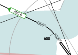
The new Lido charts have a very nice SID INITIAL CLIMBS topographic chart showing the initial climb headings (see Figure 1) for all the runways together with expected minimum altitudes before initializing the turns. Also included are prominent obstacles and Navaids. Additionally they feature tables per runway in OBSTDEP charts listing all the obstacles per runway.
The old Navtech charts feature charts for the SIDs FFITZ1, NOEND1, KNIK9. TURNAGAIN5 and ANCHORAGE6 together with an engine failure version of all of them. These are all of the available SIDs for PANC. The new Lido charts feature charts for the SIDs NOEND1, KNIK9, ANCHORAGE6, the rest are completely missing. I have no idea what happened here, but this is absolutely inacceptable. I also reported this to their support forum (Update: Page no longer exists). Since these SIDs are also not mentioned on the INITIAL CLIMBS page, this seems indeed intentional.
Taking a look at the single SID chart that is available in both of them and does more than just an initial turn and then vectoring to some Navaid, NOEND1, the Lido chart is quite nice to look at. Unfortunately the added topographic information comes at the cost of losing the co-ordinates of the individual waypoints. So, if you are using an FMC without SID-capabilities (the FlightFactor A350 comes to mind) or the CIVA INS, you must rely on some other source of information for these. For me personally this is fine since PFPX lists the individual waypoint co-ordinates on my flight plan anyway.
Summarizing this section the Lido charts are indeed the more appealing product for the SIDs, Navigraph just must make sure they cover all the charts available for any given airport.
STAR Charts
On the STAR side everything seems to be included in the new product that was included before.
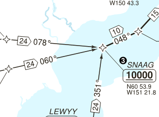
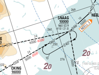
I abitrarily pick the NEELL3 approach. As with the whole theme of the new charts, this one also includes topographic information as well as obstacles. This is in general quite useful, but can make it look quite congested. Compare Figure 2 and 3 to judge the difference for yourself. It really boils down to a matter of taste. I personally rather like the new presentation.
Terminal Charts
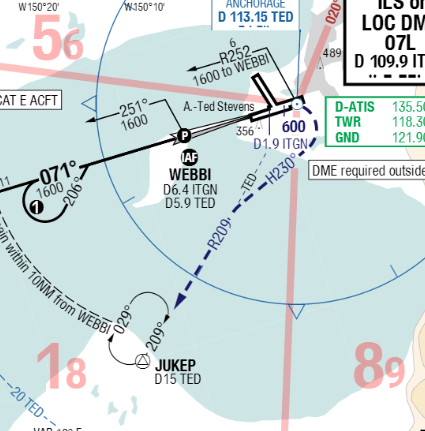
The terminal charts contained in both sets also seem to be complete. I will take a look at the ILS approach for runway 07L, an approach I frequently take. Again, the difference orientation becomes instantly apparent. In this case I rather prefer the old layout with a horizontally aligned runway in comparison to the magnetic north up orientation of the new charts, to me it is clearer to read. The basic approach information (courses, frequencies etc.) are identical, of course. But some of the other information differs. As shown in Figure 4, the MSA circle is presented differently on the new chart since it is integrated in scale on the chart itself, which I like. The topographic information relies more on color-coding than on the printing of actual numbers. I am not sure if I like that. I usually print out charts on a black and white laser printer and it depends how it shows in grayscale. I will do a test on that later on in this review. The new charts contain a much more detailed presentation of the visual aids present at the runway threshold and the runway itself, of how much use this really is for the simulation case of course depends on the quality of the scenery you have installed. The only real disadvantage in comparison to the old chart is the less detailed ground speed to descent rate table. Not really a fundamental thing, but it can be quite useful in the less sophisticated planes on non glideslope approaches, occasionally.
Black and White Print Readability
As expected the topographic information in the old terminal charts are easier to read on black and white prints although it is still acceptable with the new version, too. The read MSA-markings on the charts are also well visible (while not exactly nice looking). All in all absolutely usable and it does not feel like a step back in quality.
Pricing
The pricing for the charts product underwent some adjustment, too. It is now available as a monthly subscription (EUR 7,50 excl. VAT) while the individual purchase option for airports has been removed. It is now also available in a discounted bundle with Navigraph’s well-known FMS Data product (EUR 65 for the first year, EUR 60 for a renewal). The 1 year charts subscription alone costs EUR 55 initially and EUR 50 for renewals.
Conclusion
For me in general the new charts are indeed a step up in usability and detail. I am very happy to renew my subscription with Navigraph. I just hope they make sure all the charts for the published procedures of any included airport are in fact supported.